After getting 100 people to fill out my questionnaire and collecting the answers I made graphs to show the results clearly and so it would be easier to analyze. I tried to have equal amounts of people from either sex fill out my questionnaire, but as my secondary research already showed that is both sexes who enjoy short films but with males tending to prefer the film noir genre.My main target age is between 18 and 35, so I tried to ask more people from that age group.
General
From this graph you can see that the audience demographic was exactly 50/50 split which will give a fair representation from both genders.
The majority of people asked were in the 20-24 age group (23%) followed by the 25-29 age (21%) and finally the 15-19 group (11%) These main groups will be my main target audience as far as age goes, although a short film will appeal to those outside this group as well.
Most people asked would consider themselves to be in the B on the socio-economic model. This demographic represents the majority of 34% of people. This shows our target audience to be middle-class and the expectations of this group is that they appreciate slightly higher brow media, such as film noir.
This graph shows the majority of 18-35 year olds (72%) watch short films. This is important as it means there is interest in short films, which are quite a niche media.
The vast majority of 90% yes which is good as my target audience need to be able to recognize the film noir genre, as it is the genre which we are emulating.
Again, the vast majority of my target audience (88%) said yes which is a good result as it shows that there is a demand for a new short film within my target audience.
The overwhelming majority of people asked (96%) said yes which shows that the genre film noir would be recognized and appreciated by my audience.
Film Poster
On a film poster the audience 43% said the main image and font/title was nearly a quater at 24%. This shows that the most prominent feature on a film poster is the image.
In answer to the question would the audience prefer a black and white or colour poster 89% said black and white and 11% said colour. This is suprising and is not the results I thought I would get. However, maybe the people questioned have picked up on the film noir theme of the questions and are conforming to their idea of a film noir poster. As I have already found out classic film noir posters are normally in very bright colours with the films themselves being black and white.
The majority of people asked (68%) agreed that the font on a film poster is very important. This is perhaps because the font often gives clues as to what the film is about and what genre it is from etc
This graph shows that the majority of people asked liked the poster d) the most. I will look at poster d) and emulate elements of it for my own poster. This will means I will fulfill what my target audience like.
Magazine review
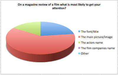
This graph shows that the main image is the crucial factor that captures the audiences attention.
This graph shows that the majority of the people asked would prefer a black and white poster compared to a brighter colour scheme.
This graph shows that the font on a magazine review is very important to the audience.
The magazine review which was liked the most was magazine b) I will look at poster d) and emulate elements of it for my own poster. This will means I will fulfill what my target audience like.


No comments:
Post a Comment